
Choosing a tattoo style is less about picking a label and more about deciding how an idea should look and feel. Line, shape, shading, contrast, colour and composition all contribute to that visual language. A single subject—a flower, portrait or symbol—can be interpreted in several different ways.
This tattoo styles guide offers a practical way to compare those visual choices before settling on a label.
Style names are useful starting points, but they are not a universal classification system. Artists may use the same label differently, and many tattoos combine approaches. Use this guide to notice what you respond to, then compare real portfolios and talk with an artist about how your idea could be translated.

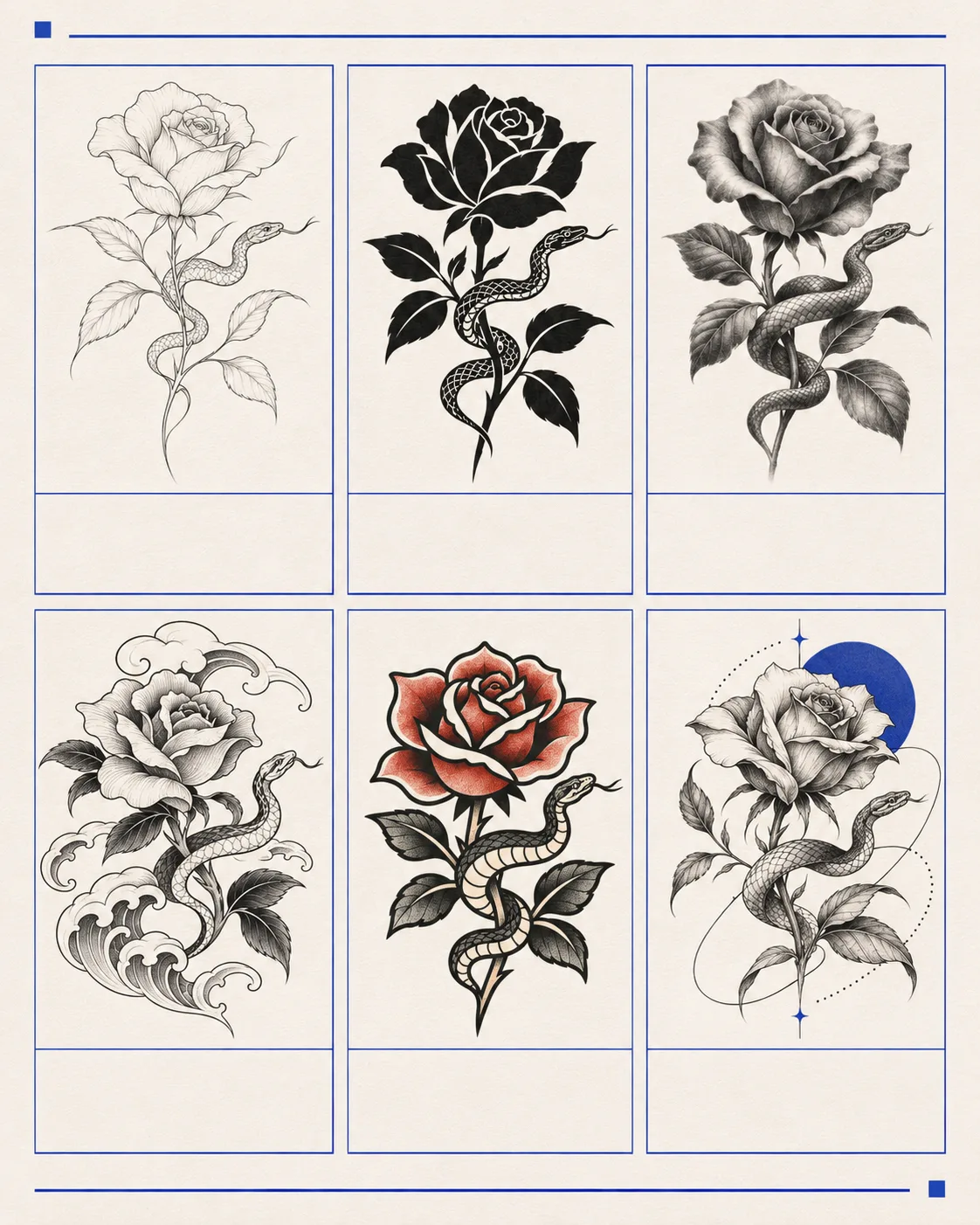
Style, subject and technique are different things
The subject is what the tattoo depicts: a bird, a face, a plant, lettering or an abstract form. Style describes the visual approach: perhaps bold and graphic, delicate and open, painterly, ornamental or close to photographic. Technique is how the artist builds the image, such as outlining, smooth tonal shading, stippling or packed black shapes.
The three can overlap without being interchangeable. A rose is a subject, not a style. It might be drawn as fine line, interpreted as a traditional flash image, rendered realistically in black and grey or reduced to an abstract shape. When someone says they want a “minimalist” tattoo, ask what that means to them: fewer details, a smaller visual footprint, simple geometry or something else.
Instead of starting with a label alone, describe the qualities you want to see: crisp or soft edges, open skin or dense fill, a narrow or broad range of tones, flat shapes or dimensional shading. These observations give you and the artist something concrete to compare.
Fine line and minimalist approaches
Fine line work places emphasis on slender contours and restrained marks. It can suit delicate lettering, small botanicals and light illustrative drawings, although fine line describes a visual quality rather than a guarantee about needle choice or final size. Artists use the term in different ways, so check the work rather than relying on the label.
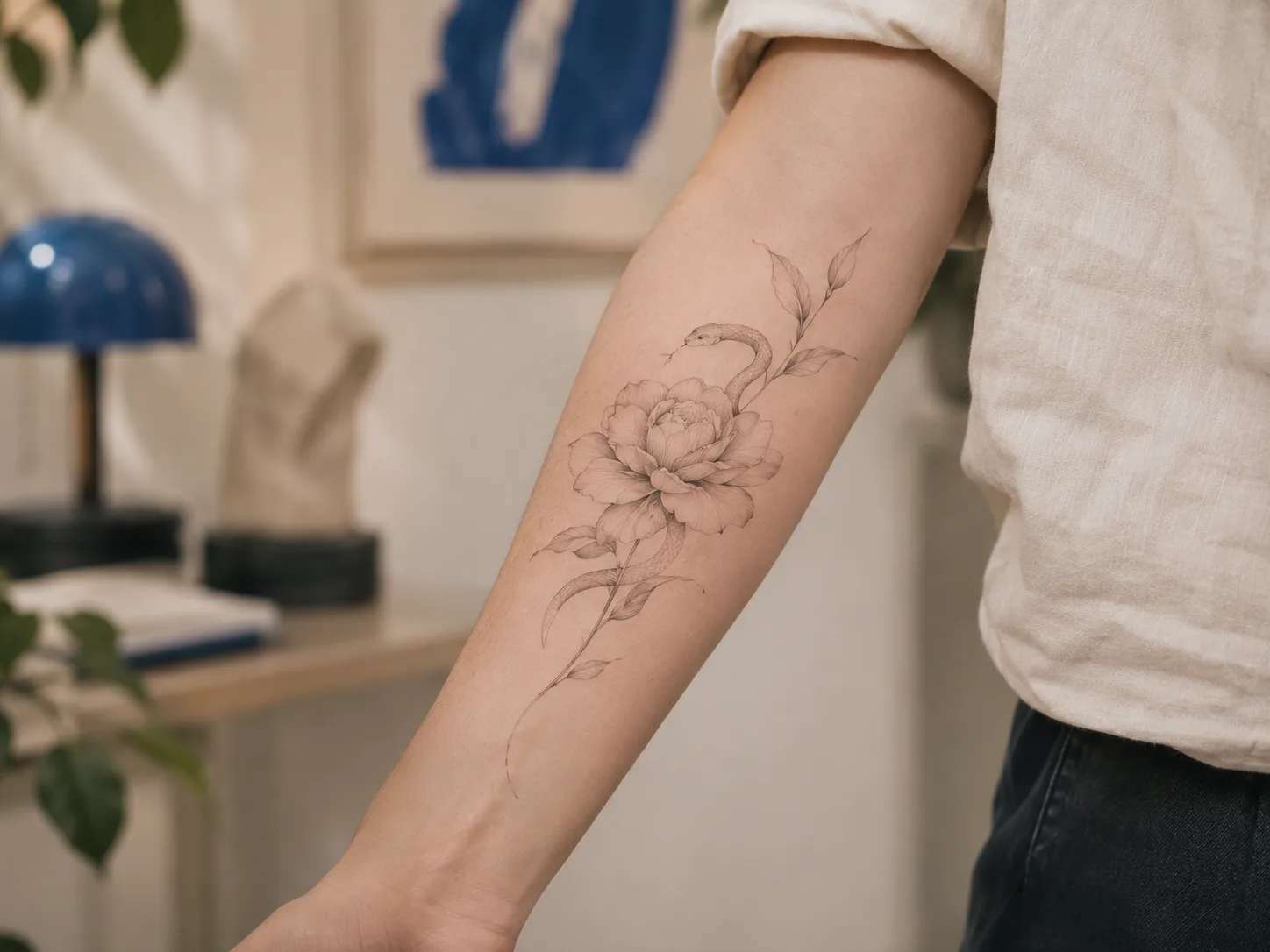
Minimalist work is about reduction: keeping only the forms, marks or details needed to make the idea read. It may use fine lines, but minimalism is not synonymous with fine line. A simple design can use a bold outline or a compact solid shape; a fine line tattoo can also contain a complex arrangement of details.
When reviewing portfolios, compare examples at a similar scale to your idea. Notice how the artist uses spacing and which details they leave out. If the concept depends on tiny marks, ask how those marks translate to the size you have in mind and whether the composition would benefit from simplifying.
Blackwork and geometric approaches
Blackwork uses black as its main visual material. Depending on the artist, it may rely on strong outlines, solid shapes, dense fills, patterned marks or the contrast between inked and uninked skin. The term covers a broad range of work rather than one fixed look.
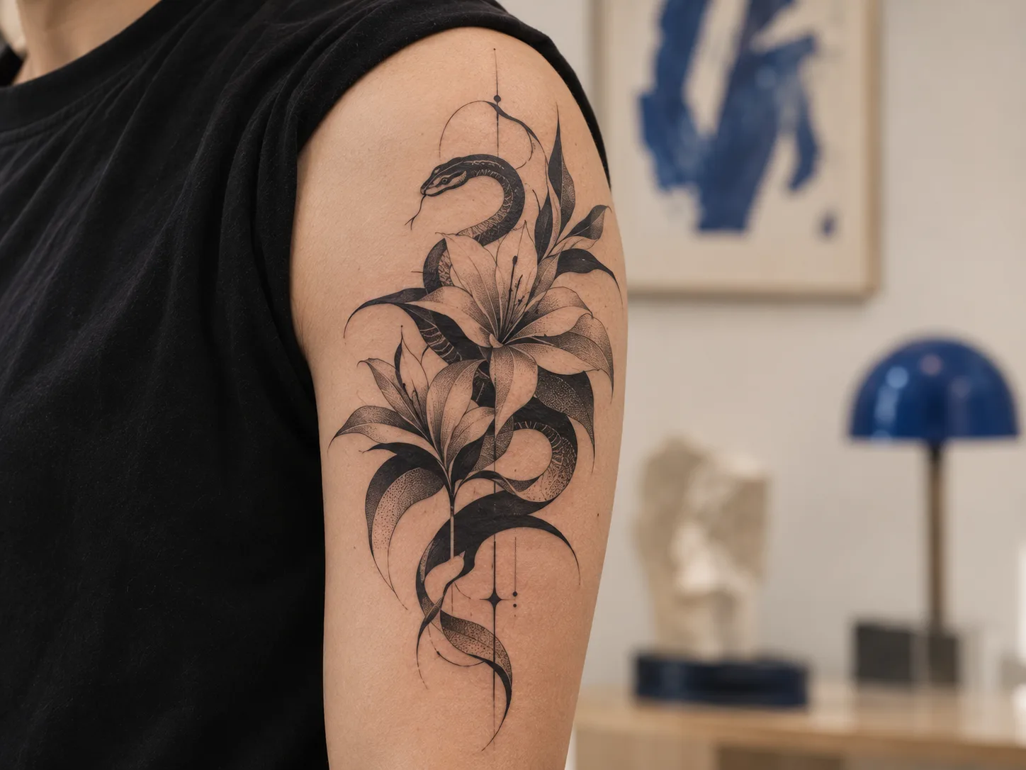
Geometric work is organized around shapes, symmetry, repetition, grids or measured relationships. Some designs are precise and diagrammatic; others combine geometry with organic imagery or ornament. The visible effect depends on how the pattern is composed and how it is placed on the body.
These approaches can overlap: a geometric tattoo may be made entirely in black, while a blackwork design may use no geometric structure at all. In a portfolio, look at spacing, balance and consistency across the whole piece. Ask how the artist will adapt repeated forms or symmetry to the intended placement.
Black and grey, and realism
Black and grey describes work built primarily from black ink and grey tones, often using changes in value to create volume, atmosphere or depth. It can be graphic and simplified, or highly detailed. Realism is an approach that aims to make a subject appear lifelike; it commonly depends on proportion, reference, light and shadow.
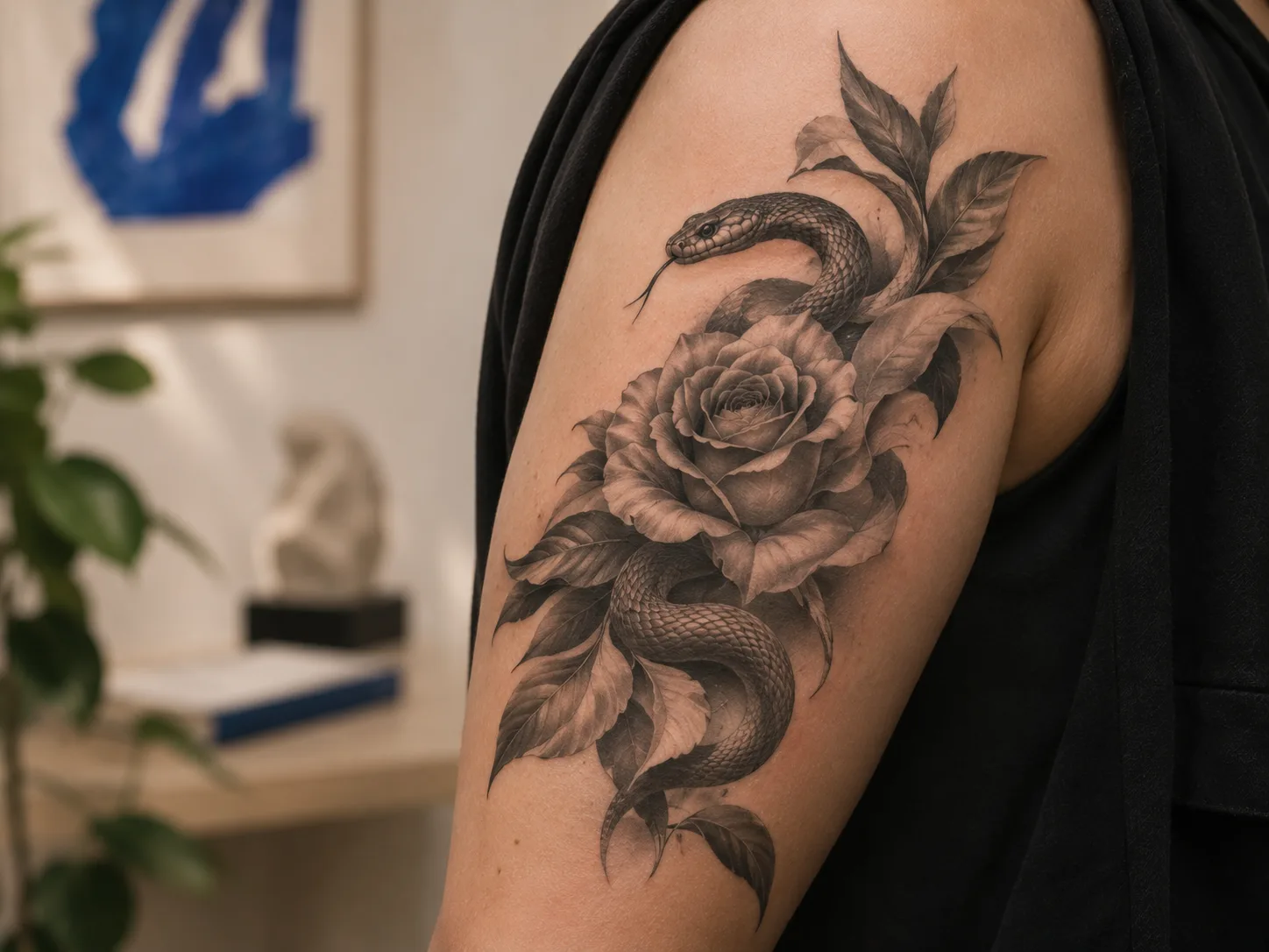
Realism can be black and grey or colour. A portrait, animal or still life may be handled realistically, but a realistic subject can also be stylized. “Realism” therefore describes an intended visual effect, not one specific subject or palette.
Compare the kind of realism you want with the artist’s actual portfolio: portrait work with portrait work, for example, or detailed animals with similar examples. Look at how the image reads from a distance as well as close up, and ask what scale the composition needs. Avoid choosing from a single dramatic crop; the full image shows how the tones and focal point work together.
American Traditional, neo-traditional and Japanese influences
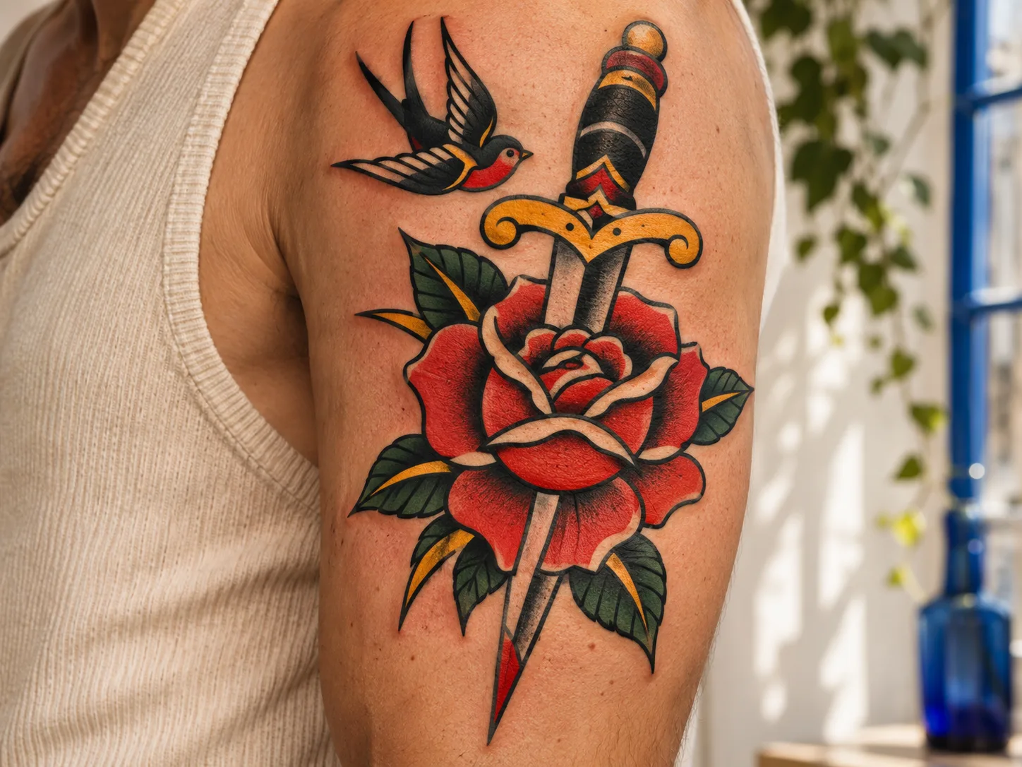
American Traditional tattooing is commonly associated with clear outlines, simplified shapes and a deliberately limited palette. The result can feel direct and graphic. Neo-traditional work often keeps some of that structure while allowing more variation in palette, detail, texture or dimensional shading. The terms are broad; compare portfolios to see how a particular artist uses them.
Japanese tattoo imagery draws on a distinct range of visual traditions and motifs; it should not be reduced to a generic “Asian” look. The Museum of Fine Arts, Boston, describes how early nineteenth-century tattoo artists in Edo drew inspiration from ukiyo-e colour woodblock prints. If you are drawn to Japanese-influenced work, look for an artist who understands the visual references and can discuss the imagery with care.
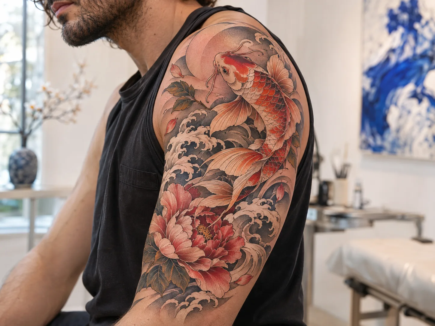
A traditional, neo-traditional or Japanese-influenced label does not tell you everything about a tattoo. Compare the artist’s composition, use of background and treatment of the subject. For culturally specific imagery, research the motif and its context rather than selecting it only for appearance.
Illustrative, botanical and abstract approaches
Illustrative tattoos borrow the feel of drawing, printmaking, comics, engraving or other image-making traditions. They may use contour, hatching, texture or deliberate stylization. The category is wide: one artist’s illustrative work may be spare and graphic, while another’s may be layered and narrative.
Botanical describes subject matter more than a single style. A leaf or flower could be rendered as a precise study, a simplified outline, an ornamental pattern or an expressive illustration. Compare the line, texture and amount of detail to find the version that feels right.
Abstract tattoos use shape, line, colour or texture without necessarily depicting a recognizable object. Some are carefully balanced compositions; others preserve a loose, gestural quality. If you are considering abstract work, explain which parts should feel controlled and which can remain open to interpretation.
How to use this tattoo styles guide with real portfolio examples
Begin with a small set of images that genuinely appeal to you. For each one, note what you are responding to: the subject, line weight, contrast, palette, amount of detail, mood or composition. This helps separate the style qualities you want from the particular design you found online.

Then compare those qualities with the artist’s own work. A useful portfolio review is specific and fair:
- Compare similar subjects and visual approaches, rather than counting posts or likes.
- Look at complete compositions, not only close-up details or cropped photographs.
- Check whether the artist’s work is consistent with the qualities you want.
- Ask how the idea might change at your intended size and placement.
- Confirm who would create the design and whether the portfolio examples are that artist’s work.
You do not need to arrive with a final style label. You can show two or three references and explain what you like in each. The artist can help identify a coherent direction, point out where the references differ and discuss what may need to change for the design to work as a tattoo.
If several styles appeal to you, ask whether they can be combined without making the image feel crowded. A clear visual hierarchy—what the eye notices first, then next—can help different influences sit together. The right balance depends on the concept and the artist’s approach.
Frequently asked questions
Can one tattoo mix multiple styles?
It can, depending on the design and the artist. Some pieces combine, for example, a realistic subject with graphic framing or illustrative details. Ask the artist to explain how the elements will relate and which visual approach will lead the composition.
Should I choose a style or an artist first?
Use style as a way to narrow your search, then compare artists whose portfolios show the qualities you want. The choice is connected: an artist can help refine the visual direction, while your preferred direction helps you identify a suitable portfolio.
Does every tattoo studio specialize in every style?
No. Studios and individual artists have different bodies of work. Review the relevant artist portfolio and ask who would handle your project. Do not assume a studio offers a particular style unless its team confirms that directly.
Find the visual language that feels like yours
A style label can open the conversation, but the useful details are what you see in the work: line, shape, shading, colour, contrast and composition. Explore FAN’s artist portfolios, then share the examples and visual qualities you love with the team during a consultation about your idea.